Background
Cisco Systems designs, manufactures, and sells networking equipment. They provide hardware and software solutions for networking, security, collaboration, and the Internet of Things.
A design system is a toolkit for designers and developers to create consistent and efficient user interfaces. It includes reusable components, style guides, and best practices.
Problem
As Cisco’s product suite grew, each team built their products independently, leading to a patchwork of designs, interactions, and language. For users switching between multiple Cisco products, this felt disjointed and frustrating.
Behind the scenes, designers were constantly redesigning the same components, and developers were rebuilding similar UI elements from scratch. This slowed down releases, introduced inconsistencies, and made it harder to scale. Without a shared system, ensuring accessibility and maintaining a high-quality user experience became an ongoing challenge.
Solution
To solve these challenges, we built a comprehensive design system that brought consistency, efficiency, and inclusivity across our entire product suite.
🌍 Accessibility and Inclusivity
Accessibility was embedded into every component from the beginning, ensuring that the system delivered inclusive, usable experiences for all users, every time.
🧩 Reusable Components
A centralized library of buttons, forms, navigation, and UI elements enabled designers and developers to move faster while maintaining consistency and quality.
📐 Pre-Designed Patterns
We created scalable, reusable design patterns for common layouts and workflows, helping teams solve complex problems more efficiently.
🎨 Visual Harmony
A unified color system, consistent typography, and well-structured spacing ensured a cohesive, polished experience across all products and strengthened brand consistency.
📖 Clear Documentation
We established detailed guidelines for typography, colors, iconography, and usage. This created a shared language across teams, ensuring everyone stayed aligned as new features were designed and developed.
Research
To build a strong, consistent, and inclusive design system, we conducted interviews with both our design team and users. This helped us understand real pain points, inefficiencies, and areas where the system could bring the most value.
🎨 Design Team Insights
We spoke to designers to learn about their daily struggles and collaboration challenges.
• Recreating Components: Designers often spent hours redesigning the same elements (like buttons, forms, and modals) for different projects, leading to wasted time and inconsistency.
• Developer Collaboration: Communication gaps during handoffs caused friction. Designers and developers often spoke “different languages,” leading to repeated explanations and rework.
• Accessibility Challenges: Designers relied on intuition or external articles for accessibility guidelines, making it difficult to ensure consistent, accessible experiences for all users.
👤 User Interviews
We also interviewed network admins, who are active users of our products, to better understand their experience with the interface.
• Redundancy: Users faced extra clicks, repeated forms, and similar tasks scattered across different screens.
• Inconsistency: Navigation, terminology, error messages, and notifications behaved differently across products, creating confusion and slowing users down.
• Accessibility Issues: Users struggled with low contrast, small text, and limited support for keyboard and screen reader navigation.
🔎 Key Pain Points Identified
From these interviews, several major challenges became clear:
• Inconsistent Design: Lack of a unified system led to fragmented experiences and increased effort.
• Slower Time-to-Market: Without reusable components, releases took longer and cost more.
• Suboptimal User Experience: Inconsistencies lowered user satisfaction and added learning curves.
• Lack of Scalability: As products grew, design inconsistencies multiplied, making expansion harder.
• Higher Development Costs: Developers spent extra time building similar components repeatedly, increasing cost and risk of bugs.
Process
As the design lead, I drove the creation of a scalable design system that would bring consistency, efficiency, and accessibility across products. Our approach was intentional, collaborative, and rooted in system thinking.
Setting the Foundations
We started by defining the core principles that would guide every design decision — from brand voice and visual identity to accessibility standards. I led the creation of foundational elements like color palettes, typography, iconography, and spacing rules that ensured visual and functional consistency across products. Refer fig 1.0 and fig 1.1.
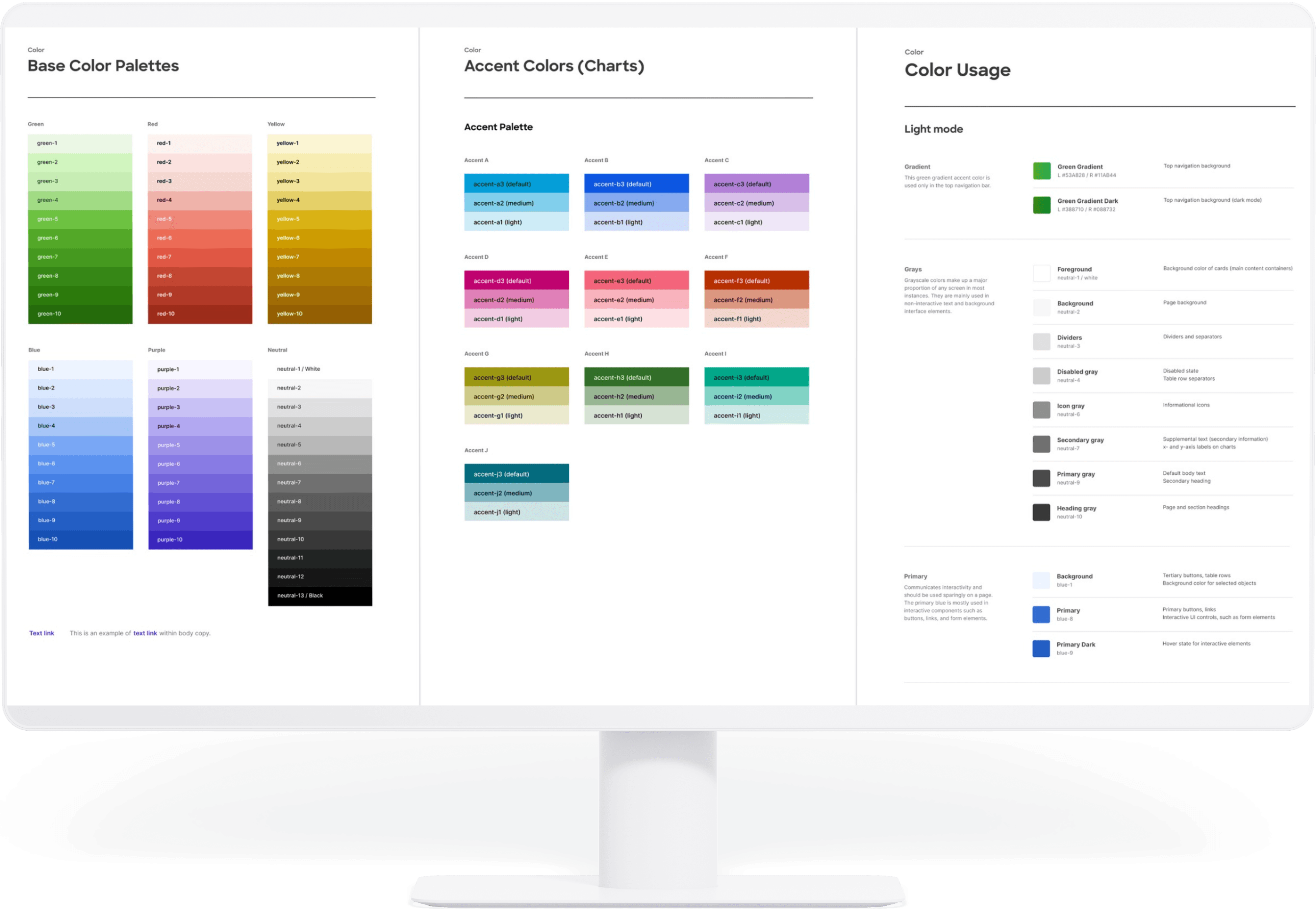
fig 1.0 Color palletes (Base, Accent, Light mode, Dark mode)
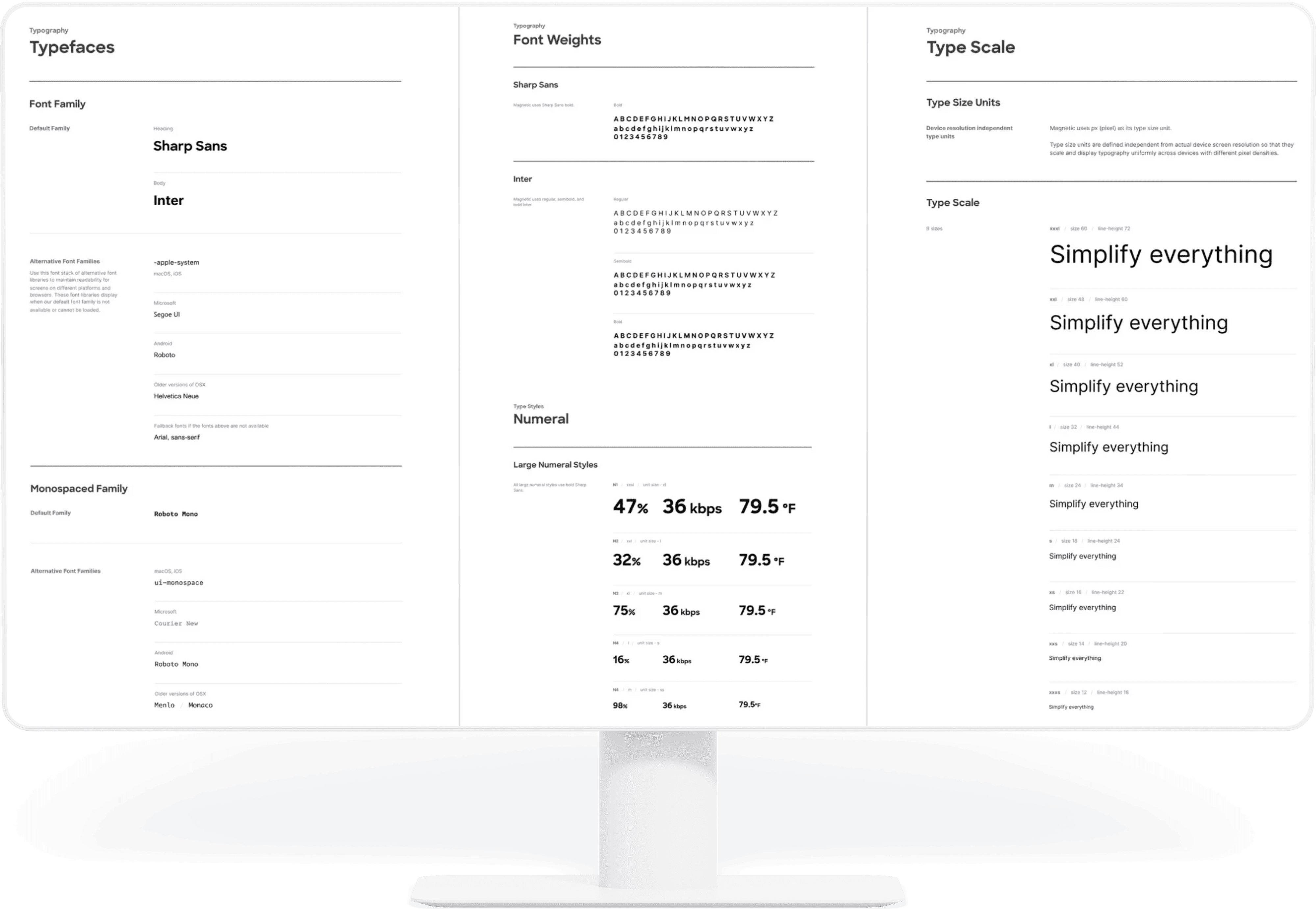
fig 1.1 Typography (Fonts, Weights, Scale, Numbers)
Building the System
We conducted a detailed audit of existing UI patterns and components across multiple products. From there, I led the structuring of a scalable component library:
• Atoms: Base elements like colors, typography, icons, and spacing.
• Molecules: Interactive elements like buttons, input fields, and drop downs.
• Organisms: Complex structures like forms, tables, navigation, and dashboards.
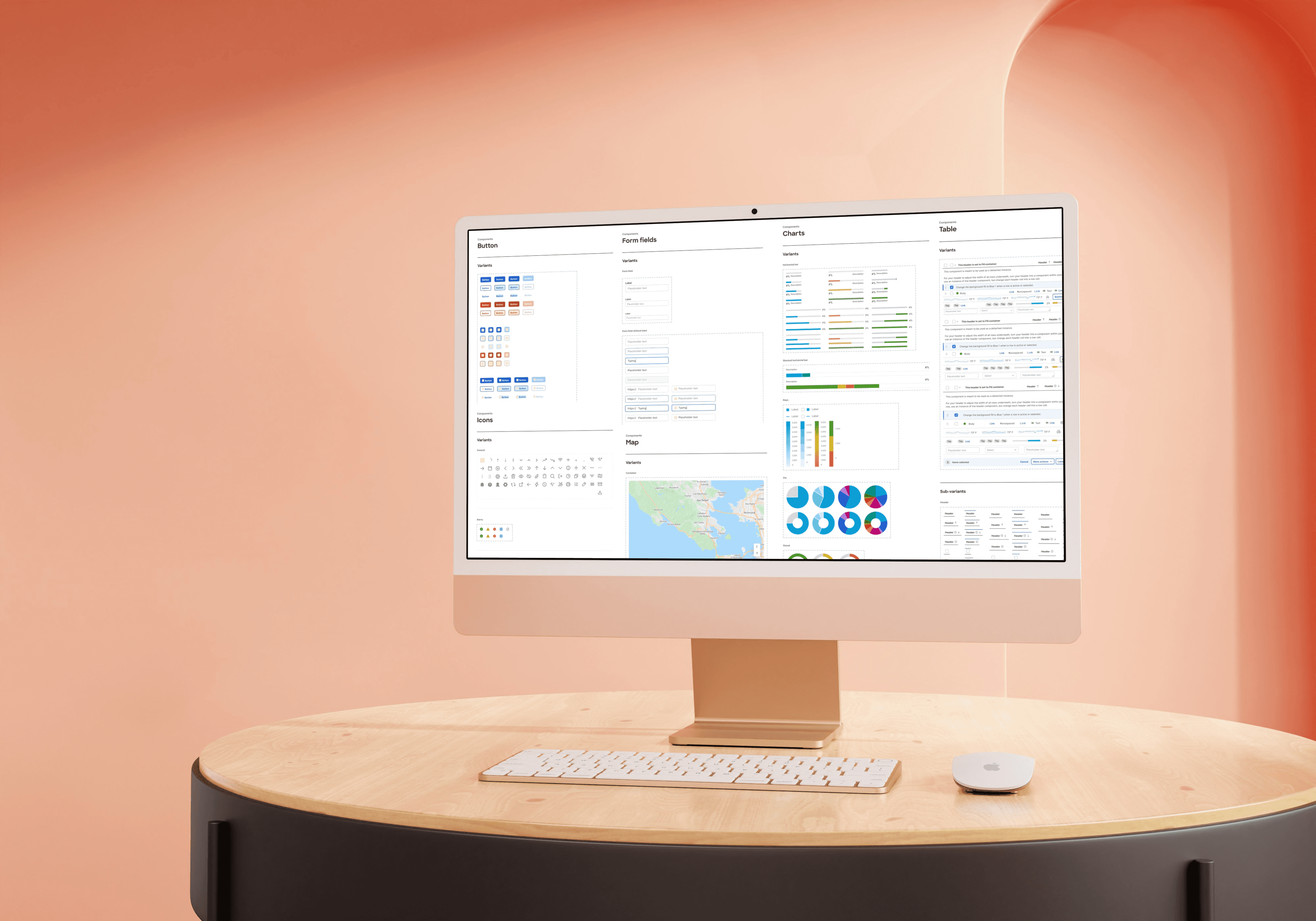
This atomic structure allowed us to build modular, reusable components that scaled easily as products evolved. Refer fig 1.3.

fig 1.3 Design components
Documenting for Clarity
Every component was documented with clear usage guidelines, naming conventions, interaction states (hover, active, disabled), and accessibility considerations. This documentation became a single source of truth that empowered both design and development teams to work more efficiently. Refer fig 1.4.

fig 1.4 Documentation
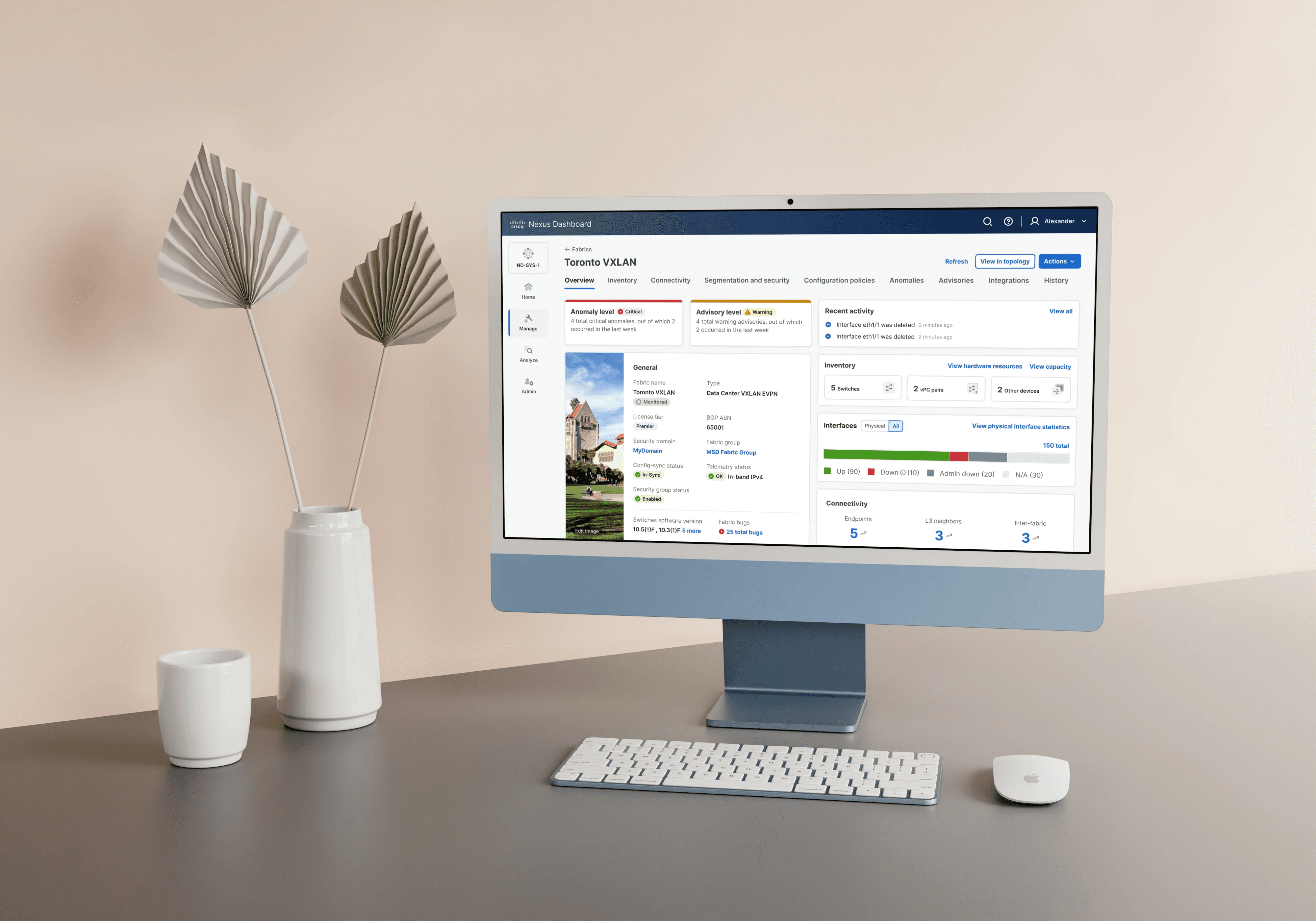
Cross-functional Collaboration
I worked closely with developers from the beginning, ensuring alignment on technical feasibility and consistency during implementation. By providing detailed specifications and design tokens, we successfully translated the design system into a reusable front-end component library. Refer fig 1.5.

fig 1.5 Collaboration
Continuous Evolution
The system was not a one-time delivery. I established regular feedback loops with designers, developers, and stakeholders to review, refine, and expand the system based on evolving product needs and user feedback. This iterative approach ensured the system stayed relevant, robust, and impactful.
Challenges
The road to building design system was not always a straight path, we did hit a few roadblocks or concerns and decided to make sure the team was onboard with the solutions -
Challenge | Solution |
|---|---|
🔄 Getting Everyone Aligned | Different teams had varying ideas about the design system’s goals. We ran workshops with designers, developers, and stakeholders early on to share goals, gather feedback, and create a shared vision. |
🕘 Managing Time Without Slowing Product Work | Finding time to build the design system without delaying product releases was tough. We solved this by developing components alongside real product features, making design system work part of the normal workflow. |
🤝 Gaining Support from Engineers and Stakeholders | Convincing engineers and stakeholders to adopt the system was a challenge. We involved them from the start, showed how the system saves time, and shared quick wins to build trust and enthusiasm. |
🌎 Ensuring Accessibility and Scalability | We needed the system to work for all users and grow with our expanding products. So, we built accessibility into every component and designed flexible patterns that scale across products and use cases. |
Impact
Building the design system brought real change to both the product and the team:
🌎 Accessibility | Made accessibility part of every component, ensuring an inclusive experience for all users, right from the start. |
🎯 Usability | Simplified complex workflows, helping users complete tasks faster and more confidently. |
📈 Scalability | Created flexible patterns and components that easily adapt to new products, features, and use cases. |
🛡️ Robustness | Established a strong, consistent design foundation that reduced design debt and rework. |
⚡️ Faster Development | Enabled teams to build and ship features faster by reusing tested, reliable components. |
🧩 Time for Problem Solving | Freed up designers and developers to focus on bigger, more impactful product challenges instead of repetitive work. |
Testimonials
After creating the design system and shipping a couple releases, here's the feedback from our design team and customers -
Using different Cisco products finally feels consistent. I no longer have to relearn where things are — everything looks and works the same. It’s just smoother and easier to get things done.”– Network Admin, Cisco Customer
"The design system has been a game-changer! I can now focus on solving user problems instead of reinventing basic UI elements. It's significantly improved my efficiency." - Product Designer Feedback
Conclusion
In conclusion, the implementation of this design system has significantly enhanced our design and development processes. By fostering collaboration, promoting consistency, and empowering our teams with a shared language, we have created a foundation for building exceptional user experiences that truly reflect our brand identity.


Let's connect
I'm not just here to design products; I'm here to connect with people.
As a product designer, I'm on an exciting journey to blend creativity with technology to craft memorable user
Current Residence
Toronto, Canada