
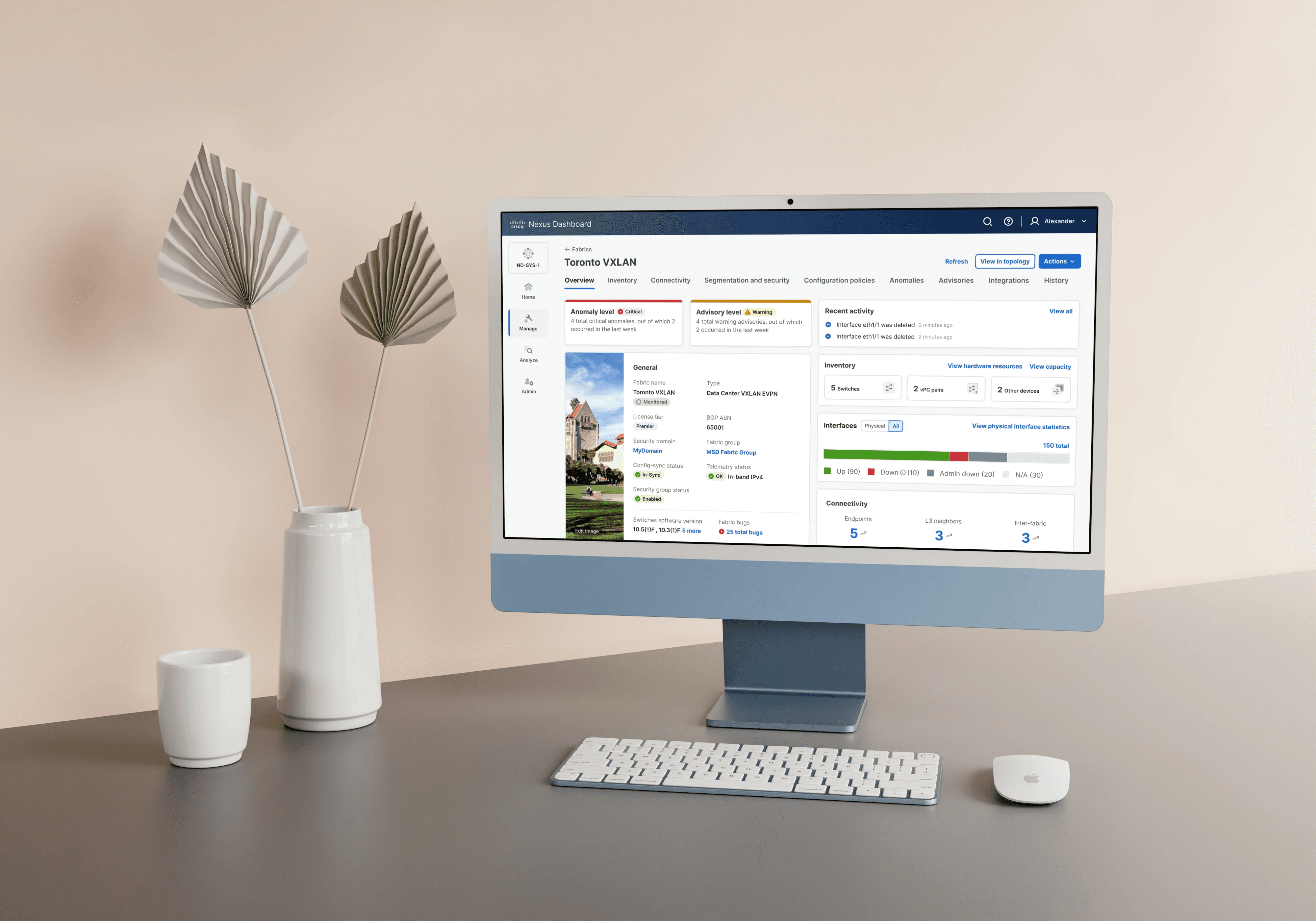
Overview
Nexus Dashboard simplifies managing Cisco’s data center infrastructure by bringing monitoring, automation, and configuration into one platform.
Problem
When we combined configuration, analytics, and admin tools into one product, the result was more powerful — but also more complex. New users struggled to understand where to start, how to configure key workflows, or even what features were available. This caused setup delays, misconfigurations, and low adoption.
“I can manage complex networks — but I shouldn’t have to guess my way through setup.” – Jen, Network Admin
Solution
We designed an interactive, step-by-step onboarding experience that guided users through setup, prevented common errors, and surfaced valuable features at the right time — all while improving adoption and confidence.
User and Business Goals
User Goal: Help users like Jen complete setup quickly, confidently, and with minimal confusion.
Business Goal: Improve adoption rates, reduce support tickets, and accelerate product growth with a seamless first-time experience.
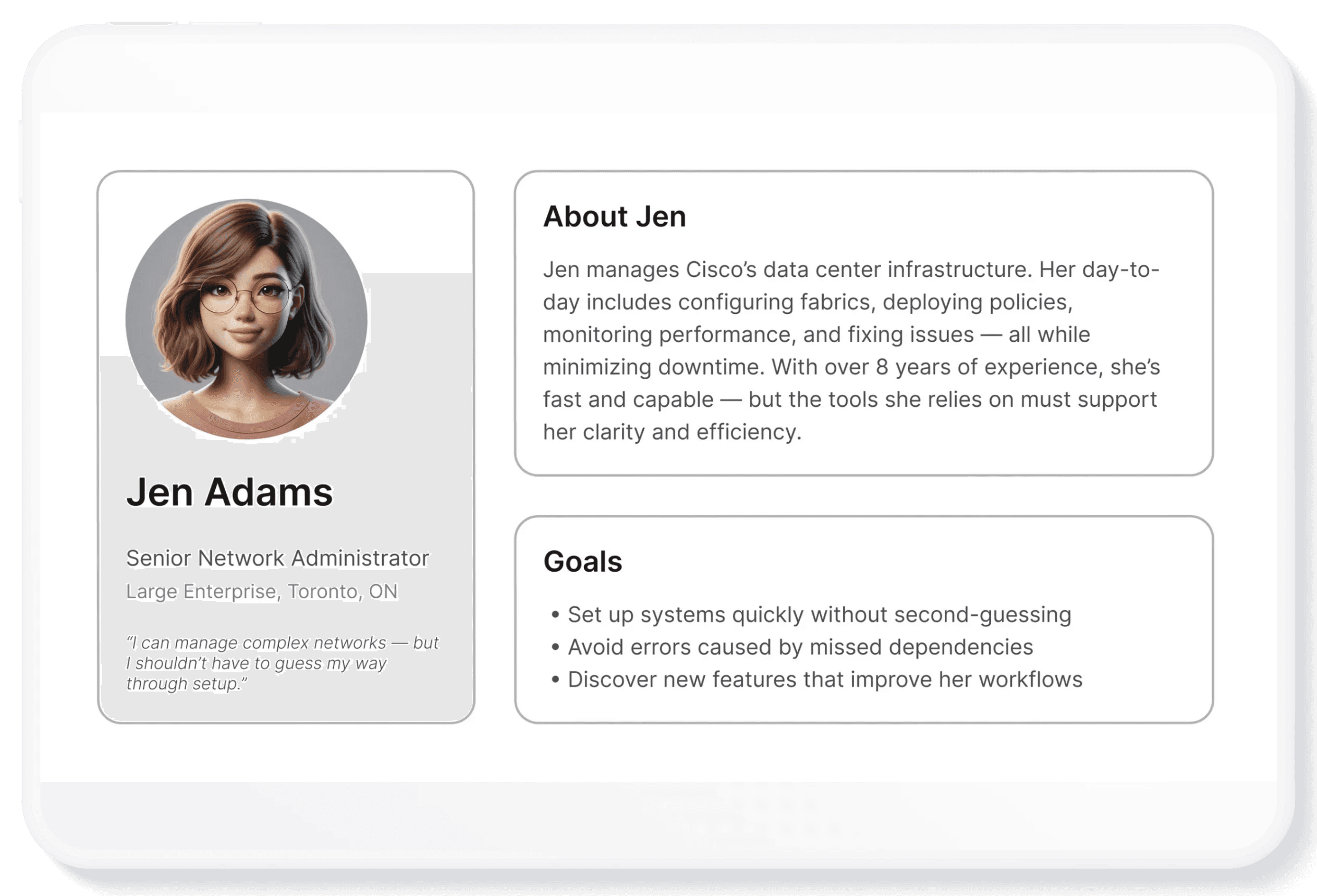
Meet Jen Adams - Our Hero User
Before we could design a better onboarding experience, we needed to understand who we were designing it for. Meet Jen Adams, a network administrator at a large enterprise. She’s responsible for setting up and managing Cisco’s data center infrastructure — a job that demands precision, speed, and zero downtime.
Research
To deeply understand Jen's challenges, I observed network admins during usability tests on Nexus Orchestrator (which had no onboarding). Key insights emerged:
• ⏳ Setup Time:
Users spent ~25 minutes manually configuring their Nexus Dashboard instance, often bouncing between screens and documentation.
• ⚠️ Dependency Errors:
Users struggled with the order of configuration steps, causing deployment failures and frustration.
• 🔎 Feature Discovery:
Many missed helpful new features simply because they were hard to find.
These patterns made it clear: users needed guidance, not more complexity.
Ideation
With these pain points in mind, I partnered with PMs, engineers, and researchers to map Jen's ideal onboarding journey:
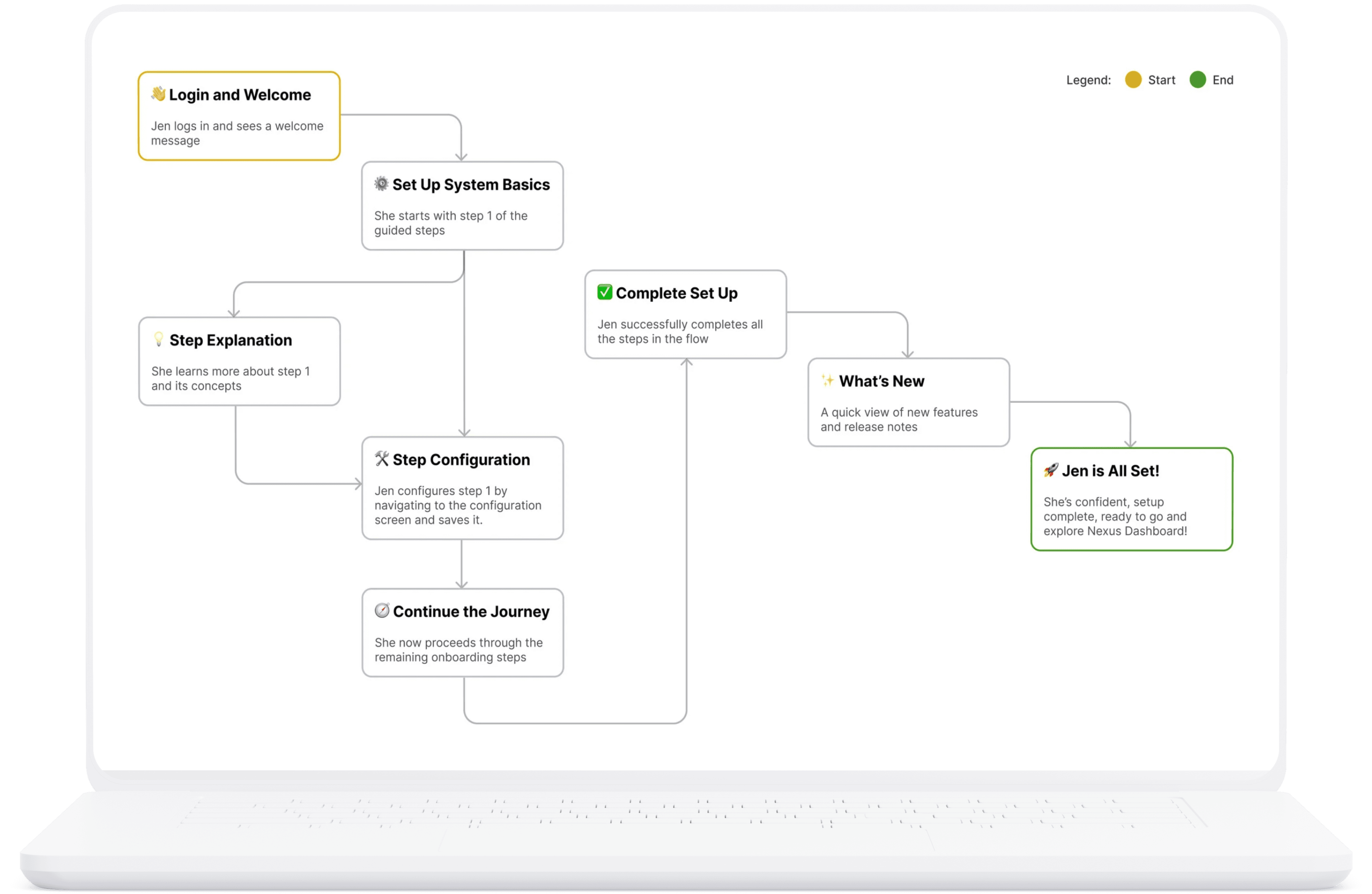
This became the foundation for our guided onboarding experience.
Challenges and How We Overcame Them
Losing Context After a Step
After completing a setup step, Jen often felt unsure about what to do next. Here’s how her feedback helped us improve the experience and make the next steps more intuitive.
Before | After |
|---|---|
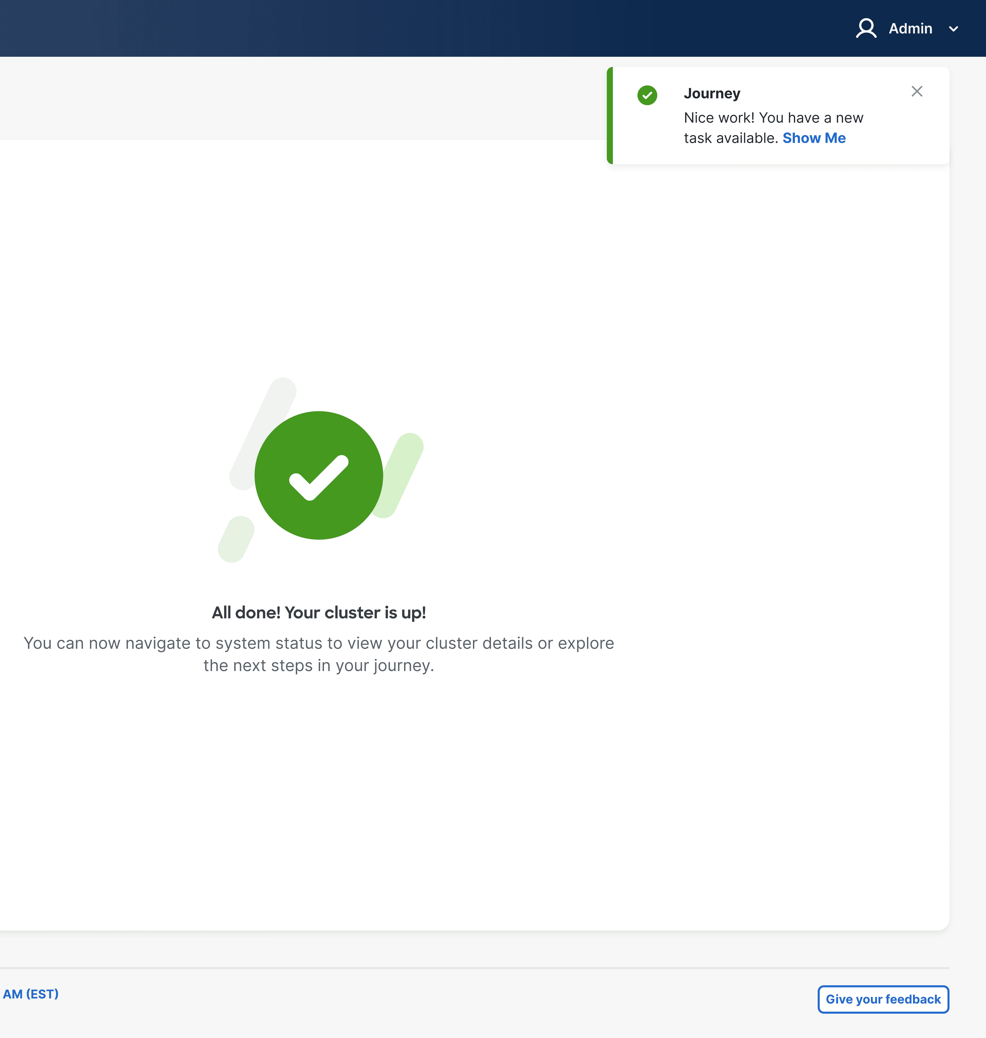 | 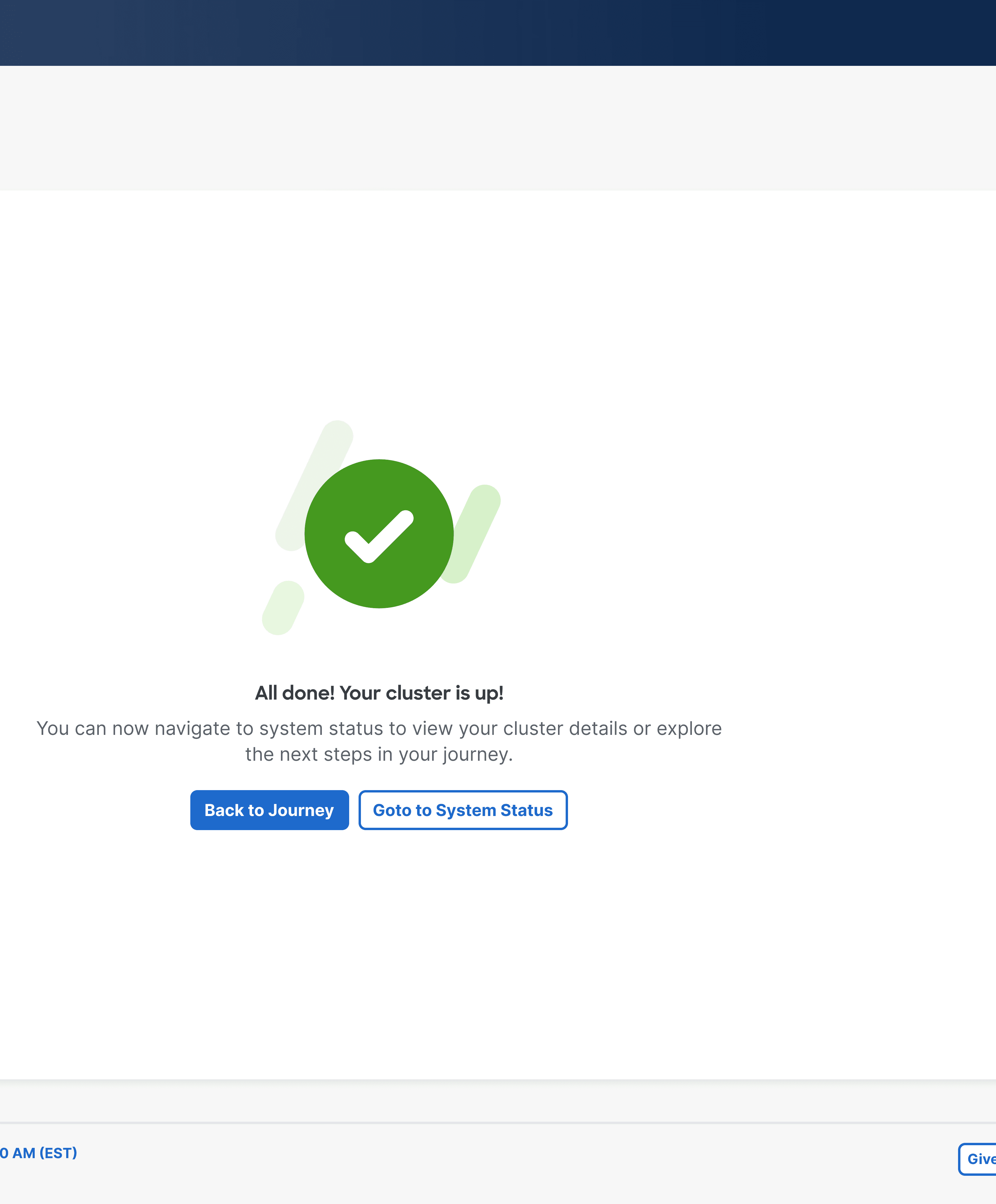 |
I had just finished setting up a network cluster, but then I felt stuck. I wasn’t sure how to get back to the main setup flow. There was a toast at the top with a ‘Show Me’ button, but honestly… I didn’t even notice it | Now, after I finish a step, I see two clear buttons: one takes me back to the onboarding journey, and the other to system status. There’s even a persistent ‘Back to Journey’ link at the top. It’s easy to know where I am — and where to go next. |
Progress Tracking Was Unclear
Jen struggled to see how much setup was done. We improved the experience by making progress clear and easy to track.
Before | After |
|---|---|
 |  |
As I completed each setup step, I had no clear sense of how far I’d come or how much was left. I found myself scrolling up and down, trying to count the steps manually. I just wanted a quick way to see my progress without guessing. | Now I can instantly see how far I’ve come. A progress donut shows me the percentage I’ve completed, and there’s even a step count — like ‘3 of 5 steps done.’ It keeps me motivated and makes it easy to know what’s next without scrolling around. |
Confusing Dependency Errors
Jen struggled to understand why certain steps were locked. Let’s see how we used Jen's feedback to make these dependencies easier to understand.
Before | After |
|---|---|
 |  |
I was moving through the setup, but suddenly some steps were greyed out. I had no idea why they were locked — it felt like hitting a wall without warning. | Now when a step is locked, I see a clear label telling me exactly which step I need to complete first. It’s much easier to understand what’s going on — I’m not stuck guessing anymore. |
Designs
👋 Greeting Screen
A welcoming first screen that sets expectations and helps Jen understand what the system will help her accomplish. Refer fig 1.0

fig 1.0 Greeting the new user and introducing them to Nexus Dashboard
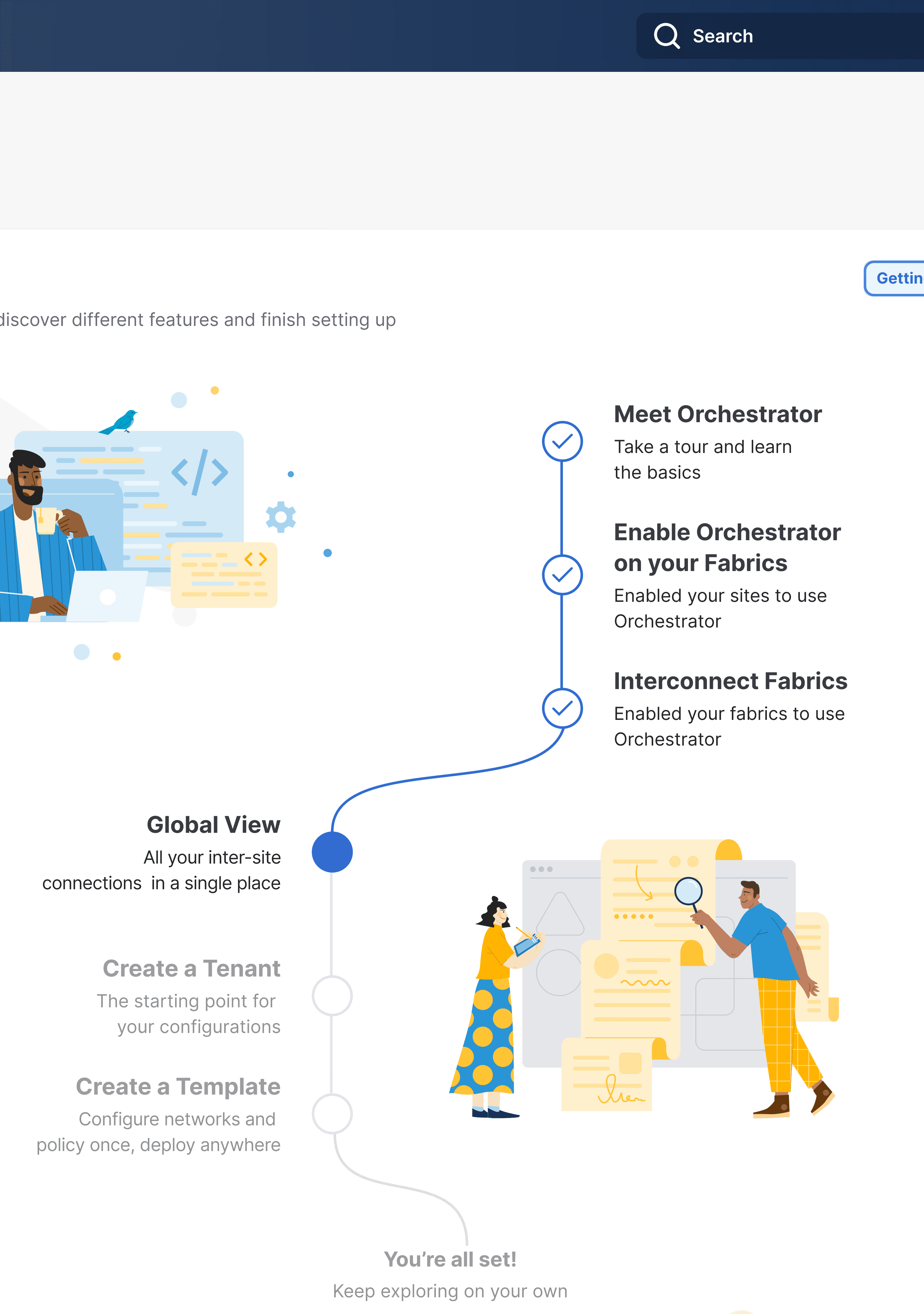
🧭 Guided Journey
Complex configurations are broken into clear, interactive steps that automatically handle dependencies and prevent order mistakes.
Journey Steps:
Policies are arranged in the order in which they need to be configured to avoid dependency errors during deployment. All policy configurations dependent on a previous policy will be disabled and tagged with the required step
Jen can always logout the system without completing the setup, her progress will be auto saved and she will be able to see her progress the next time she logs back in
Jen will also be able to view the new key features that have been implemented in the latest release, along with any other features that might help her to secure the network
Refer fig 1.1

fig 1.1 Showcases the guided steps for the user to set up nexus dashboard product
Step Actions
Learn more: This side panel will tell Jen more about the policy and how to configure it. Refer fig 1.2
Go: This action will help Jen navigate to the policy configuration screen in the product. Refer fig 1.3.1 and fig 1.3.2
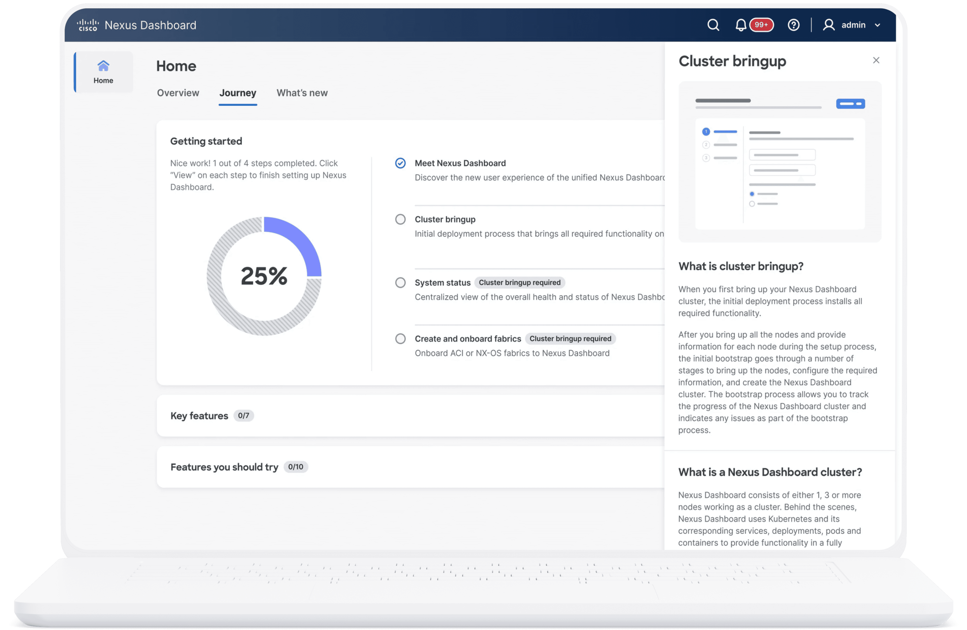
fig 1.2 Step Explanations in a side panel
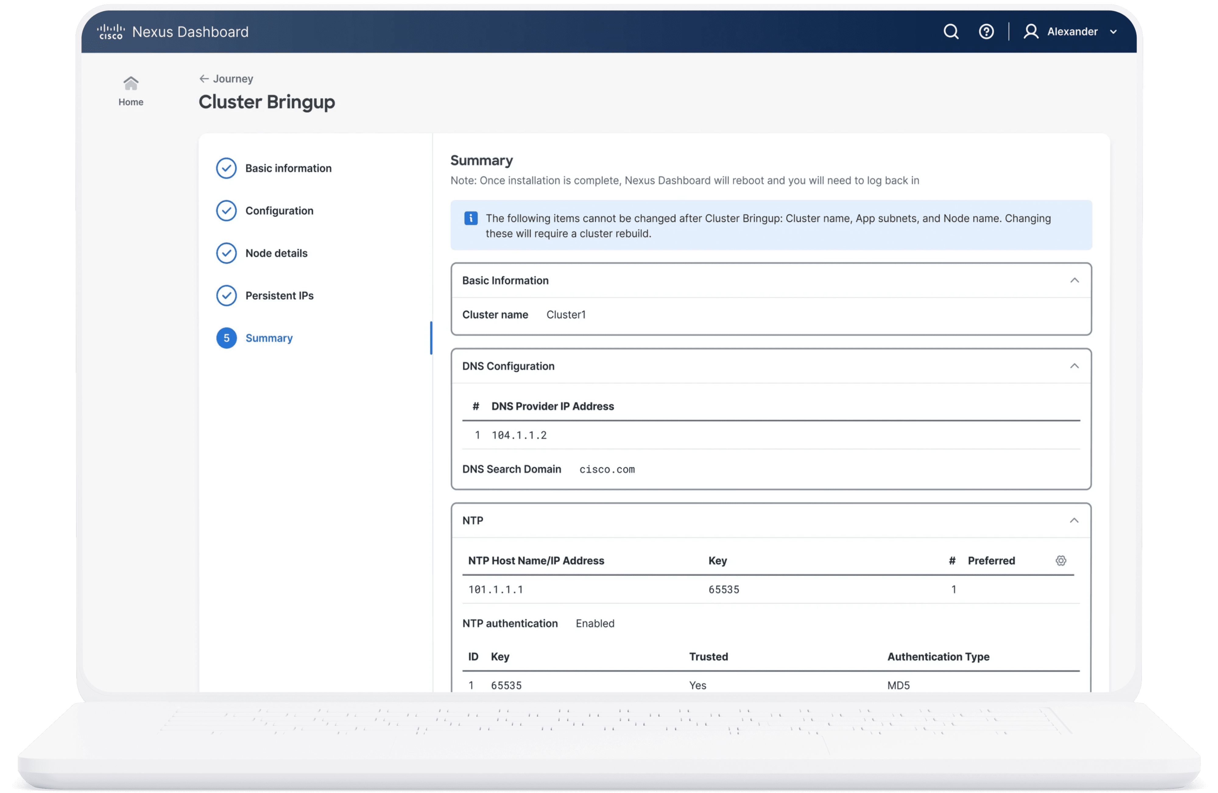
fig 1.3.1 Policy configuration screen

fig 1.3.2 Saving policy configuration screen
✨ What’s New Section
A dedicated area surfaces recent releases and new features, helping Jen stay informed without effort. Refer fig 1.4
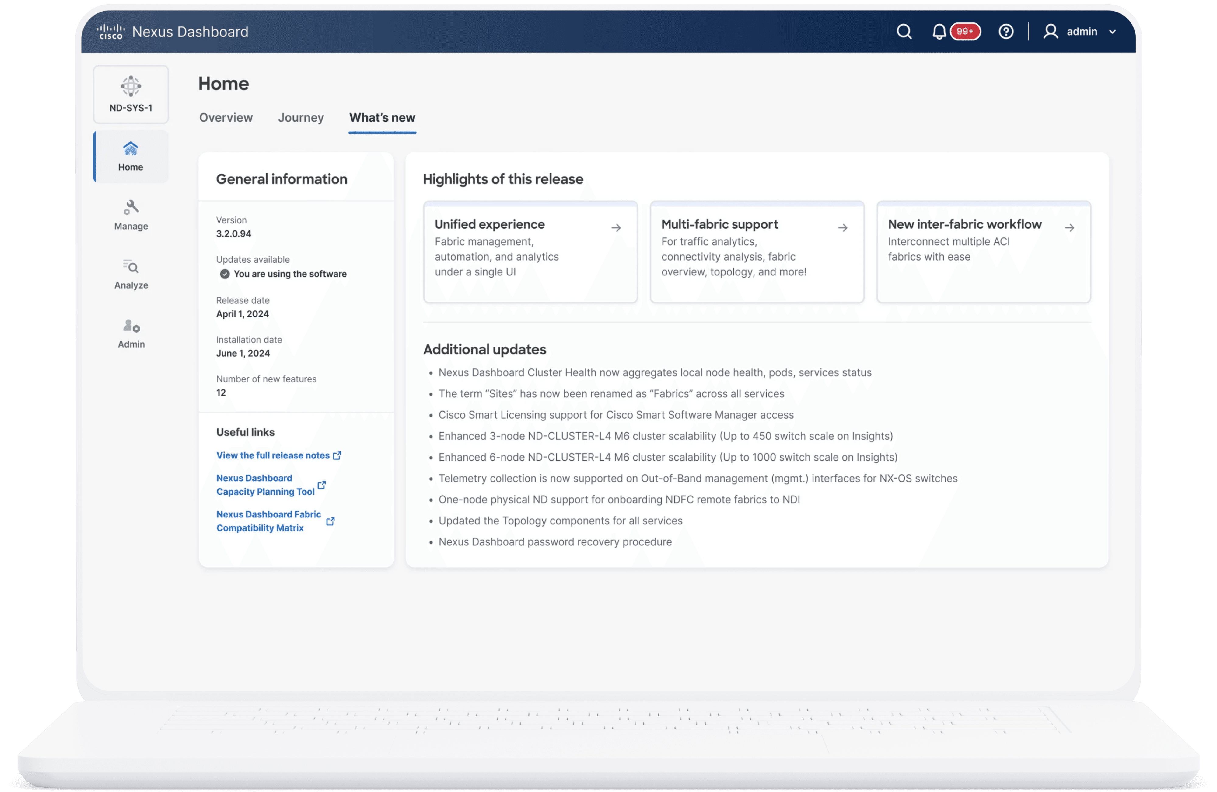
fig 1.4 New tab with the new release information
Impact
Our iterative design process led to clear, measurable outcomes:
• ⏱ Setup Time: 89% of users now complete setup in just 10 minutes (down from 25 minutes).
• ⚙️ Dependency Errors: 90% configure their networks without running into dependency blockers.
• 📣 Feature Discovery: 80% of users easily discover new features and releases.
Beyond the numbers, we gave users like Jen the confidence and control they needed to succeed.
“The onboarding felt like a teammate guiding me through the process. I never felt lost.” — Jen Adams, Network Admin
Reflection and Conclusion
This project transformed a highly technical onboarding process into a guided, human-centered experience. We simplified complexity, reduced errors, and made adoption faster and smoother for our users.
Personally, this reinforced my belief that even in enterprise software, design must serve people first. By deeply understanding user behavior, collaborating cross-functionally, and simplifying without oversimplifying, I helped create an onboarding system that not only improved user satisfaction but also supported business growth.
By bringing in the voice of the user and aligning cross-functional teams around a shared experience vision, we helped users go from “Where do I start?” to “I’ve got this.”
At the end of the day, great design isn’t about removing complexity — it’s about guiding people through it.


Let's connect
I'm not just here to design products; I'm here to connect with people.
As a product designer, I'm on an exciting journey to blend creativity with technology to craft memorable user
Current Residence
Toronto, Canada