Overview
Managing multiple fabrics across large data center environments often feels like trying to diagnose a complex system with blindfolds on. That’s where we found our user persona, Jim, juggling tabs, CLI outputs, and inconsistent data to piece together a basic picture of fabric health and connectivity.
Our goal was clear:
Give Jim one dashboard that tells him everything he needs to know about a fabric — without digging, guessing, or switching tools.
That vision became the Fabric Dashboard in Cisco Nexus Dashboard — a modular, high-signal control center that empowers network operators to monitor, understand, and act confidently.
Problem
Before the dashboard existed, Jim (and other network admins) had to check multiple locations just to answer fundamental questions:
• How is this fabric doing overall?
• Are there anomalies or alerts I need to know about?
• What’s the current traffic pattern?
• Is this fabric connected properly to others?
It was time-consuming, error-prone, and didn’t scale — especially as fabrics became more interconnected.
Why A Dashboard?
The team explored multiple patterns like list views, tabbed drill downs, and hybrid tables.
But we kept coming back to one question:
“What would Jim need to see in the first 60 seconds of troubleshooting?
That clarity drove our decision to build a summary dashboard. One that:
• Offers quick signal over noise
• Surfaces what matters, based on context
• Scales across different fabric types and configurations
Ideation and Design Decisions
Anomaly & Advisory Cards
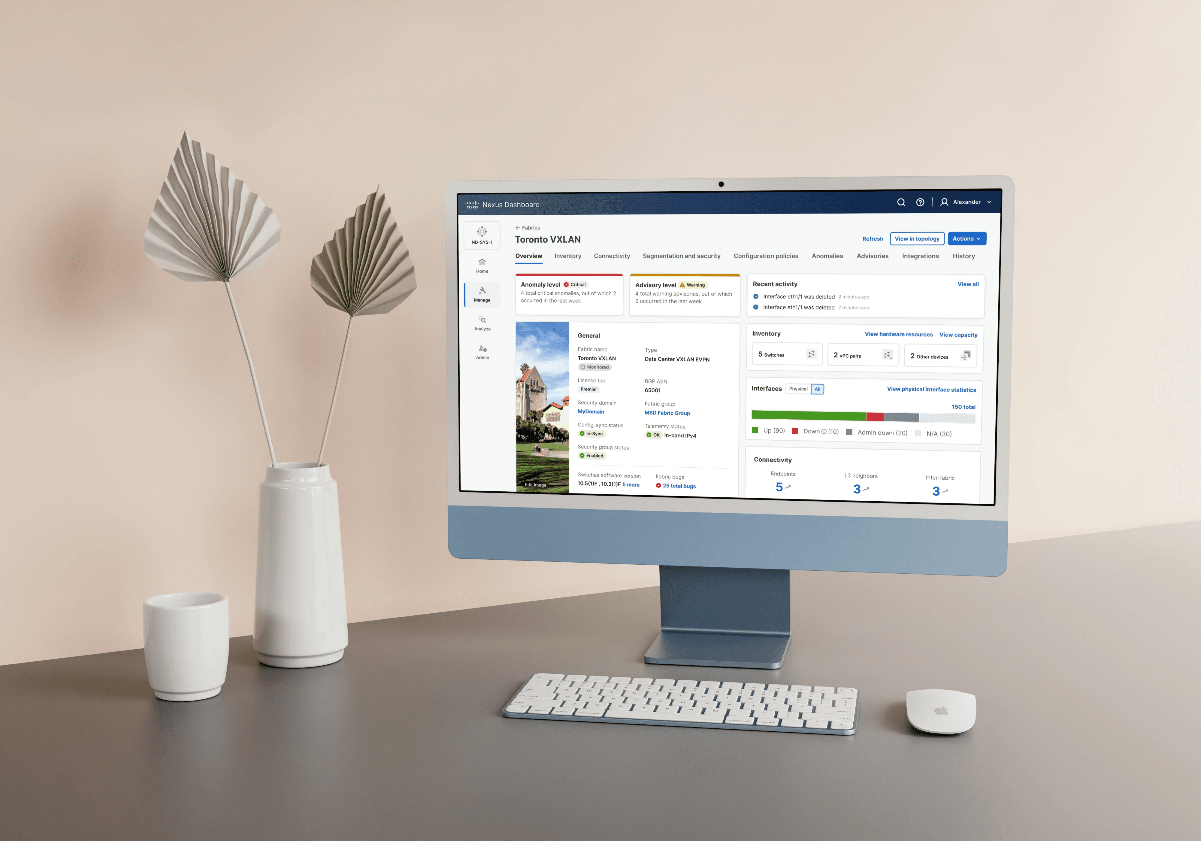
Decision: Place critical alerts right at the top in visually distinct cards.
Why: To prevent users from missing urgent issues. The cards show total anomalies, how many occurred recently, and their severity — giving JIm instant situational awareness.
Refer fig 1.0.

fig 1.0 Anomaly and Advisory Cards for quick criticality view
General Fabric Information
Decision: Present basic fabric attributes — name, type, software versions, license tier, fabric group, config-sync status — in one “General” card.
Why: These attributes are often referenced together. This format reduced scan time and kept foundational context always visible.
Refer to fig 1.1.

fig 1.1 General Card stating information of the fabric
Inventory & Interfaces Breakdown
Decision: Group all hardware stats — switches, vPC pairs, and interface status (Up, Down, Admin Down, N/A) — into modular cards.
Why: Helps operators assess capacity and detect outages at a glance. Color-coded bars for interfaces bring immediate visual clarity.
Refer fig 1.2 for inventory card and fig 1.2.1 for interfaces card.

fig 1.2 Inventory card with counts for switches and virtual port channel pairs
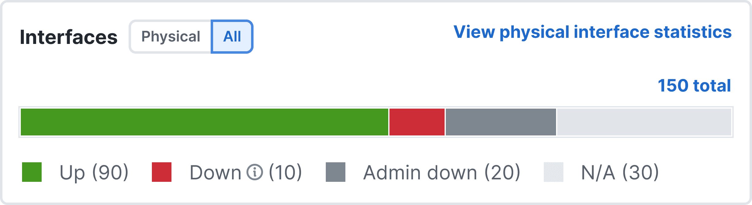
fig 1.2.1 Interfaces card with up/down statuses
Connectivity Insights
Decision: Display counts for endpoints, L3 neighbors, and inter-fabric connections.
Why: These counts reveal reachability and communication health — especially critical in VXLAN/EVPN environments.
Refer fig 1.3.

fig 1.3 Toronto fabric connectivity details with other fabrics via policies
Recent Activity Log
Decision: Show recent events (like deleted interfaces) in a mini activity feed.
Why: Operators often need a timeline of changes to correlate with issues. This helped reduce context-switching.
Refer fig 1.4.

fig 1.4 A quick recent activity
Traffic Overview (External Data Transfer)
Decision: Add a card showing total data transferred, peak traffic, and a donut visual for sent vs received.
Why: Gave users a sense of network load and behavior over time — a crucial input for detecting congestion or spikes.
Refer fig 1.5.

fig 1.5 External traffic card to visualize how data traffic is flowing via Toronto fabric
Analytics Summary
Decision: Include mini-cards for:
• Conformance health
• Congestion status
• Sustainability
• Traffic analytics
Why: These insights, powered by analytics engines, surface health scores and patterns that would otherwise be buried. Each card is independently useful and contributes to a holistic view.
Refer fig 1.6.

fig 1.6 Analytics summary showing the performance of Toronto fabric across different categories
The Thinking That Shaped Our Designs
What was the thinking? | How did it shape our design? |
|---|---|
Signal vs noise | Only show what’s needed now; let users dive deeper later |
Reusable patterns | Cards are modular and scalable for future additions |
Adaptable structure | Designed for different fabric types without redesign |
Strong visual hierarchy | Color, typography, and spacing help users instantly understand what’s urgent, what’s normal, and what needs checking |
Designs In Action
Fabric Dashboard:
“When I select a fabric, the first thing I see is an overview tailored to that fabric type. Right away, I get a sense of how healthy the system is and where I should focus my attention. It makes troubleshooting faster and way more strategic.”
– JIm, Network Admin
(Refer to Fig 2.0)

fig 2.0 Toronto Fabric Dashboard
Card Panels:
“I noticed a spike in anomalies and a warning on advisories — definitely something I need to check. With just one click, I can dive into detailed reports, including sustainability insights for this fabric. I didn’t have to click into multiple layers to find the sustainability report — everything I need is right there.”
– JIm, Network Admin
(Refer to Fig 2.1, 2.2, 2.3)

fig 2.1 Details of anomalies raised on Toronto fabric in the last 15 mins

fig 2.2 Details of advisories raised on Toronto fabric in the last 15 mins
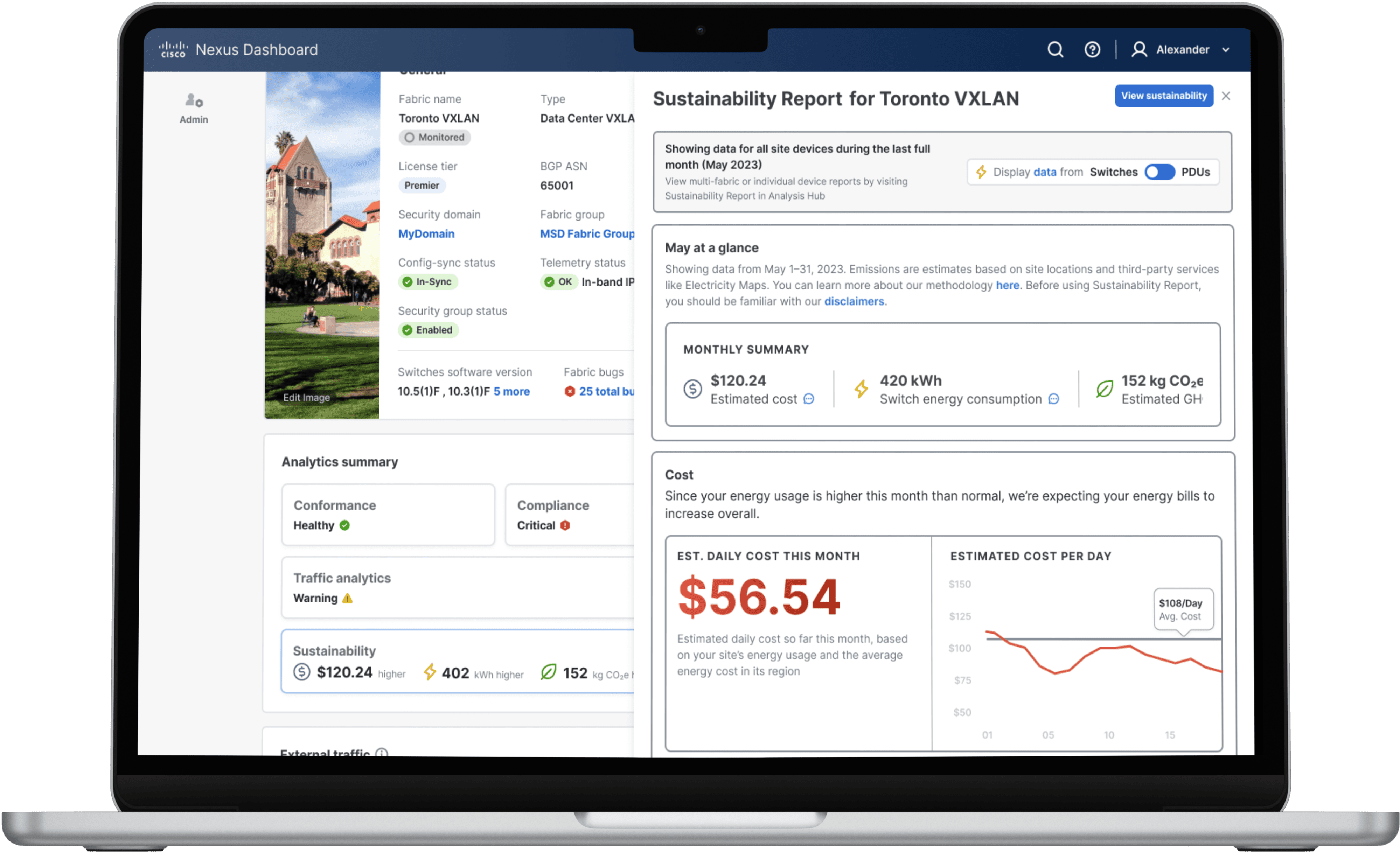
fig 2.3 Sustainability card panel showing the energy and cost spending by Toronto fabric
Impact
Following release and internal adoption:
• 🔍 Reduced troubleshooting time by 40% compared to the previous flat views.
• 🧪 Improved issue detection rate by surfacing anomalies early.
• 🚀 Became the default landing view for most fabric types in Nexus Dashboard.
One user said:
“It’s like having a command center for each fabric — finally everything makes sense without hunting for it.”
What's Next?
This dashboard is just the beginning. Next, we’re exploring:
• 📈 Time-based trends for anomalies, interface flaps, and traffic.
• ⚙️ Direct actions from cards (e.g., “View Switch Logs” or “Acknowledge Advisory”).
• 🧠 Predictive insights using anomaly learning to alert before things go wrong.
• 🌐 Custom views for different admin roles (e.g., operator vs auditor).
Final Reflection
This project taught us that designing for scale and clarity aren’t at odds — they’re inseparable.
By deeply understanding the cognitive load of our users and surfacing only the most relevant signals, we gave Jim not just visibility — but control.
That’s the true power of design: turning complexity into confidence.


Let's connect
I'm not just here to design products; I'm here to connect with people.
As a product designer, I'm on an exciting journey to blend creativity with technology to craft memorable user
Current Residence
Toronto, Canada